Your website isn’t just a digital business card in 2025 — it’s your first pitch, your elevator intro, your sales team that works weekends. And if it’s looking outdated or trying too hard to “look cool,” it might be turning customers away before they even scroll.
Blink twice and that “fresh new design” from 2020 suddenly feels like it belongs in a museum — next to Ask Jeeves and vertical video.
But don’t worry — we’ve got you. Below are the 10 web design trends for 2025 that are more than just pretty pixels. These are design shifts that connect, convert, and actually help people use your website better.
Let’s start from the top. Literally.
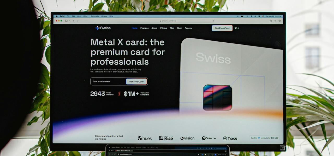
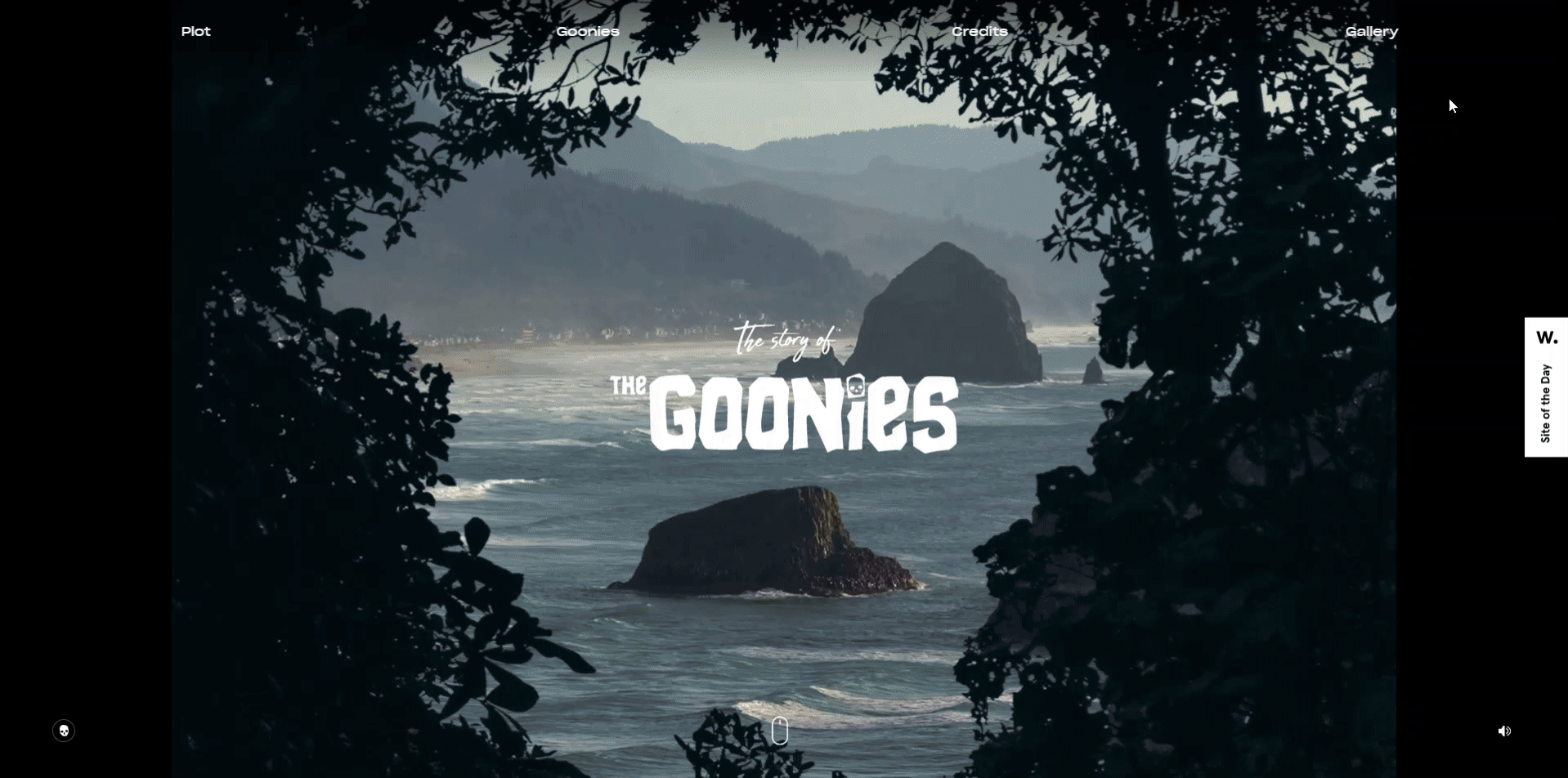
1. Full Page Headers
If your website opens with a tiny headline floating above a blurry stock image from 2017… we need to talk.
Headers have gone full-screen — and for good reason. The top of your homepage isn’t just a title anymore, it’s your brand’s opening act. Full-page headers use all that prime real estate to hit visitors with something bold: striking visuals, clear messaging, and usually one call to action that’s actually worth clicking.
It’s not just about looking modern (though it definitely does). It’s about grabbing attention without overwhelming. A full-page header lets you say, “Here’s who we are, what we do, and what you should do next,” all in one clean, confident visual. Whether it’s a looping video, a moody image, or a bit of subtle animation, this is where your brand sets the tone.
And on mobile? These headers shine. They scale beautifully, reduce decision fatigue, and guide people straight to the good stuff without a dozen distractions.
The full-page header is more than a trend. It’s your digital first impression, leveled up.
2. Minimalist Design
Minimalist design is still going strong in 2025, and for good reason — nobody has time (or patience) for busy layouts filled with pop-ups, floating widgets, and fifteen competing colors screaming for attention.
Minimalism doesn’t mean boring — it means purposeful. It’s about choosing what actually matters and letting everything else take a back seat. Clean typography, intentional whitespace, and just the right amount of contrast let your message breathe. And let’s be real: breathing room is a luxury on the web these days.
One of the biggest wins here? It makes everything easier. Easier to read. Easier to navigate. Easier to trust. A minimalist layout shows people you know what you’re doing — you’re confident enough to keep it simple.
Plus, it loads faster, scales beautifully on mobile, and gives off that sleek, high-end feel without needing fancy animations or flashy gimmicks. Think of it like the design version of a crisp white shirt — timeless, effortless, and always a good idea.
3. Bento Grids
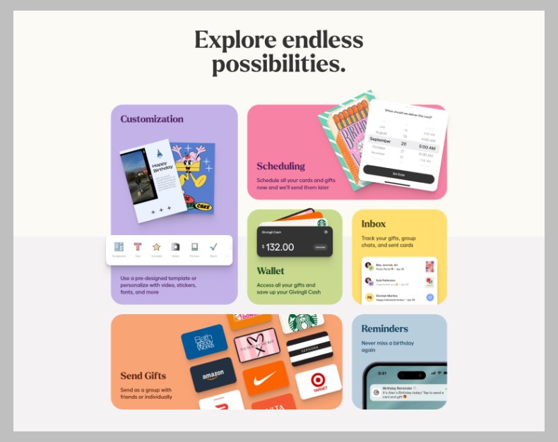
You’ve probably seen them already — those sharp, boxy layouts with perfectly arranged little content blocks. Welcome to the Bento grid, the grid system that said, “What if your website looked like it came from the future and still made sense?”
Inspired by Apple, Bento grids are a modular approach to layout design where text, images, icons, and CTAs are tucked into neat, bite-sized containers. The beauty of it? You can show a lot of stuff — features, services, stats, product highlights — without turning your page into a wall of text or a chaotic mess.
It’s like content Tetris, but without the stress.
What makes Bento grids a standout in 2025 is that they’re visually engaging, easy to scan, and ideal for mobile. Each block becomes its own tiny experience — which keeps users engaged as they scroll. And from a design standpoint, they’re incredibly flexible. You can go clean and minimal, or get bold with color, animation, and texture inside each tile.
So if your site’s content feels like it’s fighting for space, a Bento layout might be the elegant answer that lets everything shine without shouting.
4. Custom Illustrations
There’s something unmistakably polished about a site that uses its own visual language. Custom illustrations have become a go-to design choice — not because they’re trendy, but because they give brands something stock photos rarely can: personality.
A well-crafted illustration can explain an idea, soften a message, or add just enough charm to make your brand feel human. It’s especially useful for businesses in more abstract spaces — software, consulting, education — where a generic image of a laptop won’t cut it.
Illustrations also adapt beautifully across a site. They scale well on mobile, they’re easier to animate if you want subtle motion, and they work just as well in a callout block as they do in a header. And because they’re made specifically for your brand, they’re consistent. No awkward mismatches or image-hunting marathons.
In a landscape where everyone’s racing to stand out, custom illustration is one of the simplest ways to do it with style — and intention.
5. Micro-Interactions
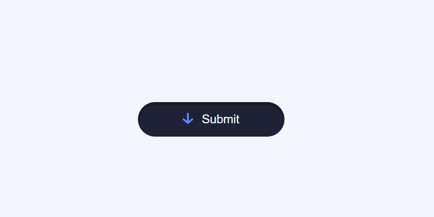
You know that satisfying little hover effect when a button glows? Or when a form shakes just a little if you forget to fill in a field? That’s a micro-interaction — and these tiny moments are doing a lot of heavy lifting in web design.
Micro-interactions are the small, subtle animations that respond to what a user does. Click, scroll, hover, submit — every action becomes a chance to give feedback, guide behavior, or simply make the experience feel smoother. Done right, they’re nearly invisible — you don’t notice them because they just feel right.
They also help build trust. When your site reacts naturally to input, it gives users the sense that things are working as they should. That the experience is thoughtful. That someone actually designed it with care.
And they aren’t just about polish — they help with function. A micro-interaction can:
- Signal that a button has been clicked
- Confirm a successful action
- Nudge a user to the next step
- Add just enough movement to make a page feel alive
They don’t need to be flashy. In fact, they shouldn’t be. Think of them like seasoning — too much, and it’s overwhelming. Just enough, and everything comes together.
6. Massive Typography
Big type isn’t new — but it’s taking center stage more than ever. Oversized typography has moved from a visual accent to a full-blown design statement. And when it’s used well, it’s not just attention-grabbing — it’s strategic.
Massive type lets you lead with confidence. It says, “Here’s what matters,” and invites visitors to absorb your message without working for it. On top of that, it builds rhythm into a layout. A bold headline paired with subtle body text creates natural flow, guiding users through the page without needing flashy graphics or gimmicks.
This trend also plays well with minimalism. When the layout is clean and the visuals are simple, bold text has room to shine — whether it’s a mission statement, product benefit, or just a single word that carries weight.
It works across industries, too. From creative studios to SaaS startups to local businesses, big type makes a big impact. It’s flexible, fast to read, and perfect for mobile. And when paired with smart layout and strong copy? It’s one of the easiest ways to give your site that modern, high-design feel.
7. Scrolling Animation
A static website might get the job done, but one that moves with you? That keeps you engaged. That feels like it’s responding to your pace? That’s where scrolling animation steps in.
This trend has evolved beyond flashy parallax effects or novelty page transitions. In 2025, scrolling animation is being used with a lot more intention. It’s about guiding the user through a story — piece by piece — revealing information at just the right time, in just the right way.
You’ve likely experienced it already: a product photo fades in as you scroll, a stat counter ticks up, or content slides into place like it was waiting for you to show up. It’s subtle, but it works. When designed well, it keeps people moving down the page without even realizing how much they’re absorbing along the way.
The key is restraint. These animations should support the content, not distract from it. When everything flows smoothly, users stay longer, engage more, and feel like they’re in the hands of a modern, thoughtful brand.
It’s one of those things where users won’t necessarily notice it — but they’ll absolutely feel it.
8. Vibrant Gradients
A few years ago, gradients were the bold comeback kid — a throwback to the early internet that somehow felt fresh again. In 2025, they’ve officially earned their place as a staple in modern web design. But they’ve also grown up a bit.
Today’s gradients are smoother, richer, and way more intentional. Instead of just being a background trend, they’re being used to highlight sections, create depth, and even guide the eye across a page. Whether it’s a subtle fade between tones or a bold, multi-color overlay, gradients bring a kind of visual energy that flat color blocks just can’t match.
Used well, they can make your site feel vibrant without being loud. They add contrast, motion, and mood — all without taking up space. And when paired with clean typography or minimalist layouts, they strike a balance that’s both professional and creative.
9. AI-Generated Images
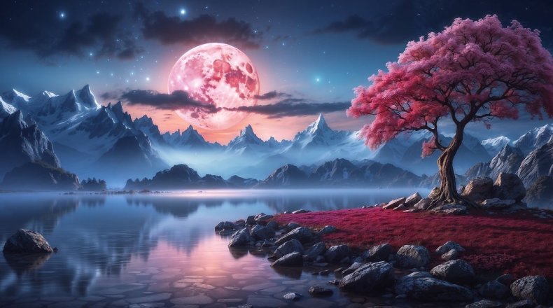
Visuals aren’t just pulled from libraries anymore — they’re being created in real-time by algorithms. With tools like Midjourney, DALL·E, Firefly, and others improving by the week, AI-generated images are becoming a serious part of modern web design workflows.
What makes them appealing? For one, they’re fast. Need a surreal, cinematic hero image of a hummingbird made of circuit boards? You can have that in 30 seconds. But more than speed, AI-generated visuals offer something stock photography rarely does: uniqueness.
Designers and agencies are using AI art to craft brand-specific illustrations, textures, and scenes that feel custom — even if they weren’t entirely drawn by hand. And while there’s still a line between “tasteful use” and “this looks like a robot had a fever dream,” the tech is evolving quickly, and the results are getting sharper, more creative, and more usable.
That said, it’s not about replacing real visuals altogether. It’s about filling in the creative gaps when custom photos or illustrations aren’t feasible — or when you want to experiment with something that looks totally different from everyone else.
Like any trend, the key is intent. AI imagery should support the brand, not become the brand. But when done well? It can add that bit of intrigue that gets people to stop scrolling and take a closer look.
10. Smart Videos
There was a time when adding video to your website meant either a YouTube embed squeezed into a layout… or a slow-loading background loop that tanked your page speed. Thankfully, we’ve moved on.
In 2025, video is smarter. It’s shorter. It’s used with purpose. Whether it’s a silent header loop, a product demo, or a micro-explainer in the middle of a landing page, today’s web video is designed to fit the flow of the site, not disrupt it.
Smart videos are compressed for performance, often auto-play muted, and tailored to support one idea at a time. The best ones don’t need narration or flashy edits — they just help the user get the point faster. That could mean showing how a product works, highlighting a transformation, or creating a sense of motion that makes a brand feel alive.
The real magic? Video builds trust. Quickly. Seeing a real person, a real process, or just a slick animation helps visitors feel like they’re not guessing — they’re getting it. And that kind of clarity leads to action.
As always, it’s about balance. A 20-second video with a clear message will do more than a 2-minute cinematic masterpiece buried at the bottom of your homepage. In 2025, smart video isn’t about going big — it’s about being strategic.
Conclusion
The best web design trends aren’t just about what’s cool right now — they’re about what actually improves the experience. Whether that’s through cleaner layouts, smarter visuals, subtle movement, or better performance, the goal is the same: help your website work harder for your business.
In 2025, great design doesn’t scream. It doesn’t overcomplicate. It just shows up with clarity, confidence, and purpose — and earns trust fast. And the brands that embrace that? They’re the ones standing out.
If your site’s feeling a little behind, that’s okay. Trends evolve — and so should your digital presence. Whether you’re planning a full redesign or just want to refresh what’s already working, staying current isn’t about chasing shiny things. It’s about showing your audience that you care about the details.
Need help bringing some of these ideas to life? We do that. And we do it with a whole lot of intention.