When someone visits your website for the first time, they’re making judgments about your business almost immediately.
Does this company look professional? Can I find what I’m looking for? Do they seem legitimate? Can I trust them to do a good job?
Most visitors won’t consciously ask themselves these questions. Instead, they’re picking up on dozens of small signals throughout the experience. The design, navigation, messaging, images, reviews, and even how quickly a page loads can all influence how credible your business feels.
This matters particularly for service-based businesses. When someone is considering hiring a contractor, accountant, landscaper, consultant, or other professional, they’re often making a decision before they’ve ever spoken to you. Your website may be their first real interaction with your business.
A polished website doesn’t automatically make a business trustworthy, but a confusing, outdated, or difficult-to-use website can quickly create doubt.
The good news is that building trust through your website isn’t about adding every possible feature or completely redesigning your site. Often, it’s about getting the fundamentals right and removing the small points of friction that make visitors hesitate.
In this article, we’ll look at 10 UX elements that can influence how trustworthy your website feels and what you can do to create a more credible experience for potential customers.
1. A Professional, Consistent Design

People don’t expect every small business website to look like a Fortune 500 company. They do, however, expect it to look intentional.
A website with consistent colors, typography, spacing, imagery, and layouts feels more polished and easier to trust. When those elements change from page to page, the experience can feel less professional, even if visitors can’t pinpoint exactly why.
Consistency also helps reinforce your brand. Your website should feel like an extension of the business customers encounter elsewhere, whether that’s your signage, social media, advertising, or printed materials.
This doesn’t mean your website needs to be complicated. In fact, a clean and straightforward design is often more effective than one overloaded with animations, graphics, and competing visual elements.
The goal is to create a website that feels deliberate, cohesive, and easy to understand.
For a service-based business, that’s especially important. Your website is often responsible for making the first impression before a potential customer ever speaks with you. A professional design can help communicate that you’re an established business that takes its work seriously.
And if your website no longer reflects the quality of the business behind it, that may be a sign that it’s time for a larger rethink. Our article 5 Signs It’s Time to Redesign Your Business Website covers some of the other warning signs to look for.
2. Clear and Intuitive Navigation

A trustworthy website shouldn’t make visitors work to figure out where to go.
When someone lands on your website, they should be able to quickly understand what your business does and find the information they’re looking for. If important pages are buried in complicated menus or visitors have to click through several pages to find a service, uncertainty can start to creep in.
For service-based businesses, your navigation should make the most important information easy to access. That usually means giving visitors straightforward paths to your services, information about your business, and a way to get in touch.
Your navigation doesn’t need to include every page on your website. In fact, keeping it focused can make it easier to use.
A simple structure might look something like:
- Services
- About
- Areas We Serve
- Resources or Blog
- Contact
The exact structure will depend on your business, but the principle is the same: visitors should be able to predict where a link will take them.
Clear navigation also reduces friction when someone is ready to become a customer. If a potential client has decided they want to learn more about a particular service, they shouldn’t have to hunt for the right page or search through your website to find your contact information.
Good navigation isn’t about showing visitors everything your website contains. It’s about showing them the right path forward.
3. Clear, Specific Messaging
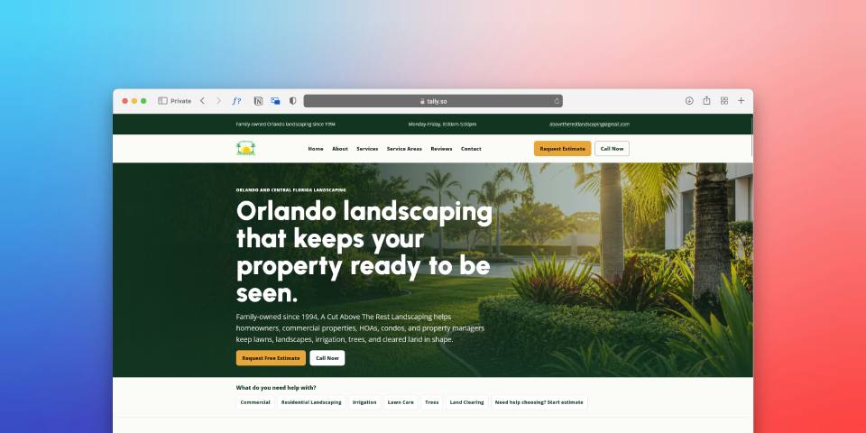
Visitors should be able to understand what your business does within a few seconds of landing on your website.
If your homepage uses vague phrases like “quality solutions,” “exceptional service,” or “your trusted partner,” visitors may not know what you actually offer. These statements might sound professional, but they don’t give potential customers much useful information.
Clear messaging builds trust because it shows that you understand what your customers are looking for.
Instead of trying to sound impressive, focus on being specific. Explain what you do, who you help, and what makes your business relevant to the person visiting your website.
For example, a landscaping company could say:
“Professional lawn care and landscaping services for homeowners in Farmington and surrounding areas.”
That’s much more useful than:
“Creating beautiful outdoor spaces with exceptional service.”
The second statement isn’t necessarily wrong, but it doesn’t tell visitors much about the actual service or who it’s for.
Your website should also make it easy to understand what happens next. If someone is interested in a service, they shouldn’t have to read several paragraphs to figure out how to get started.
Clear messaging doesn’t mean filling every page with text. It means making sure the information that matters most is easy to understand.
This is particularly important for service businesses with multiple offerings. If visitors aren’t sure which service applies to their situation, they may leave rather than trying to figure it out. Creating dedicated, clearly explained service pages can help remove that uncertainty and give each offering the attention it deserves.
Ultimately, trustworthy messaging answers the questions visitors are already asking:
What do you do? Who do you help? Can you solve my problem? What should I do next?
The clearer your website can answer those questions, the easier it becomes for a potential customer to move forward.
4. Real Photos and Authentic Visuals

The images on your website can influence how visitors perceive your business just as much as the words on the page.
Generic stock photography isn’t automatically a problem, but when every image feels disconnected from the business, it can make the website feel less personal and less credible. A staged photo of a smiling professional pointing at a laptop doesn’t tell a potential customer much about the actual company they’re considering hiring.
Whenever possible, use visuals that give visitors a better sense of the real business.
For a contractor, that could mean photos of completed projects, your team working on-site, or the equipment you actually use. For a professional service business, it might mean photos of your office, staff, or the people customers will interact with.
Authentic imagery gives visitors something tangible to connect with. It also helps answer an important question: “Is this a real business I can feel comfortable hiring?”
The quality of your photos matters, too. You don’t necessarily need an expensive professional photo shoot, but blurry, poorly lit, or outdated images can work against the impression you’re trying to create.
Your visuals should also support the information on the page rather than simply filling empty space. If you’re describing a specific service, showing relevant examples of that work is much more useful than adding a decorative stock image.
The goal isn’t to eliminate stock photography entirely. It’s to make sure your website feels connected to the real business behind it.
When visitors can see your people, your work, and your environment, your website becomes more than a collection of marketing claims. It gives potential customers a clearer picture of who they’re considering doing business with.
5. Testimonials, Reviews, and Social Proof
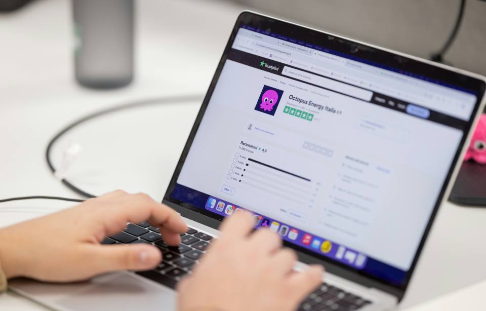
When someone is considering hiring your business, one of the biggest questions they have is simple: “Can I trust this company to deliver?”
Your website can tell visitors how experienced, professional, and reliable you are, but those claims are naturally going to be viewed as marketing. Testimonials, reviews, and other forms of social proof give potential customers evidence from people who have already worked with you.
That’s what makes social proof such a powerful trust signal.
“A brand is no longer what we tell the consumer it is — it is what consumers tell each other it is.”
Scott Cook, Co-Founder of Intuit
A strong testimonial doesn’t just say that your business is “great.” It gives visitors some context about the customer’s experience. What problem did you help them solve? What was the experience like? What result did they get?
For example, compare:
“Great company! Highly recommend.”
with:
“Alliance helped us rebuild our website and made it much easier for customers to find our services. We’ve already noticed more people reaching out through the site.”
The second example gives a potential customer something they can actually evaluate. It helps them imagine what working with your business might be like.
Make Your Social Proof Specific
Where possible, include details that make testimonials more credible and useful.
Consider including:
- The customer’s name
- Their company name or role, when appropriate
- A photo, with their permission
- The specific service they used
- The problem you helped solve
- A measurable or meaningful result
You can also connect testimonials to the services they’re describing. If someone is reading your landscaping service page, for example, a review specifically about your landscaping work is likely to be more persuasive than a generic testimonial buried on your homepage.
Don’t Rely Only on Testimonials
Your website can build credibility in several other ways, too.
Links to your Google reviews, industry memberships, certifications, awards, case studies, project portfolios, and recognizable clients can all provide additional evidence that your business is legitimate and experienced.
The important thing is to use real proof. Don’t manufacture testimonials, exaggerate results, or add logos simply to make the website look more established than it is. Trust is difficult to build and easy to lose.
Social proof works best when it feels natural and relevant to the visitor. Instead of telling people that they should trust you, show them why other customers have trusted you.
For a potential customer who is comparing several businesses, that evidence can be the difference between thinking “This company looks good” and “I feel comfortable contacting them.”
6. Easy-to-Find Contact Information
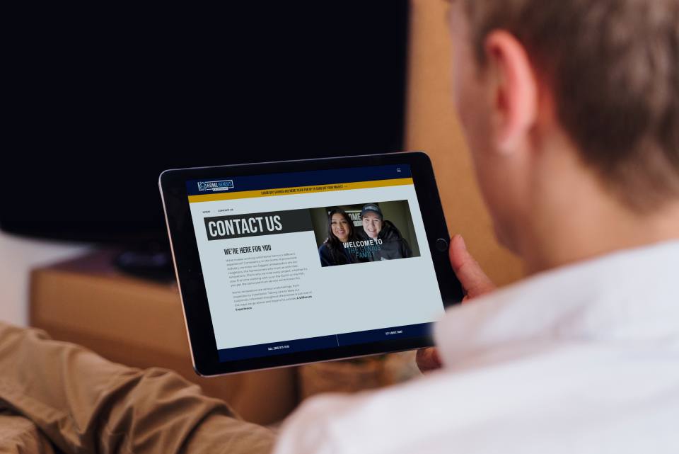
A visitor shouldn’t have to search your website to figure out how to contact your business.
It sounds obvious, but contact information is surprisingly easy to overlook. Some websites bury their phone number in the footer, hide their contact page in the navigation, or make visitors complete several steps before they can reach someone.
That creates friction at exactly the wrong moment.
If someone has decided they’re interested in your service, your website should make it obvious how they can take the next step. Depending on your business, that might mean calling, filling out a form, sending an email, booking an appointment, or visiting your location.
Your contact information should be easy to find throughout the website, not just on a dedicated Contact page.
For many service businesses, that means having a visible phone number in the header, a clear contact button, and straightforward calls to action throughout important service pages. On mobile devices, making a phone number easy to tap can make the experience even simpler.
It’s also worth making sure your contact information is consistent everywhere it appears. Your phone number, email address, business name, hours, and location should match across your website and other important online profiles.
Make Contact Forms Easy, Too
A contact form can be useful, but it shouldn’t feel like an application process.
Only ask for the information you actually need to start the conversation. A form asking for a name, email, phone number, and a brief description of what the visitor needs is often enough to begin.
Long forms with unnecessary questions can discourage people from completing them, particularly when they’re still deciding whether they want to work with you.
Your website should also set reasonable expectations about what happens after someone submits a form. A simple message explaining when they can expect to hear back can make the process feel more transparent.
Ultimately, accessible contact information sends a subtle but important message:
We’re a real business, we’re available, and we’re easy to reach.
That may seem like a small detail, but when a potential customer is deciding whether to trust you with their money, their home, their business, or their time, those small details matter.
7. A Fast, Reliable Experience
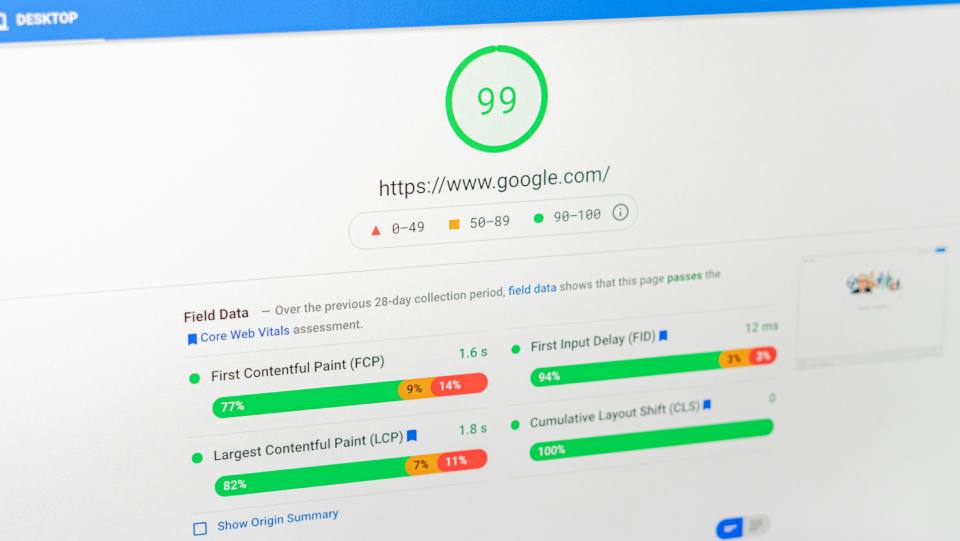
A website can look professional and have great messaging, but if it takes too long to load or doesn’t work reliably, that credibility can disappear quickly.
Think about your own experience online. If you click a link and the page takes several seconds to appear, images don’t load properly, or buttons don’t respond the way you expect, you probably don’t think, “This must be a trustworthy business.” You start wondering whether something is wrong with the website.
Performance affects more than convenience. It contributes to the overall impression visitors form about your business.
Google considers page experience across several factors, including loading performance, interactivity, and visual stability. Its Core Web Vitals provide a framework for measuring some of these aspects of the user experience.
For a small business, you don’t need to become an expert in technical performance metrics to understand the takeaway: your website should feel fast, stable, and dependable.
That means paying attention to things like:
- Large images that haven’t been properly optimized
- Videos or animations that slow down the page
- Broken links or buttons
- Pages that shift around while loading
- Forms that don’t work properly
- Outdated plugins or website software
- Hosting that can’t keep up with your website’s needs
Reliability matters, too. A website that occasionally throws errors, has broken pages, or displays outdated information can make visitors question how well the business operates behind the scenes.
This is one reason website maintenance shouldn’t be treated as an afterthought. Regular updates, backups, security checks, and monitoring can help prevent small technical problems from turning into a poor customer experience.
The goal isn’t to make your website technically perfect for the sake of a score. It’s to make sure technology isn’t getting in the way of the experience you’re trying to create.
A visitor should be able to arrive on your website, move between pages, interact with your content, and contact your business without wondering whether something is going to break.
A reliable website quietly reinforces the idea that your business is reliable, too.
8. Mobile-Friendly Design
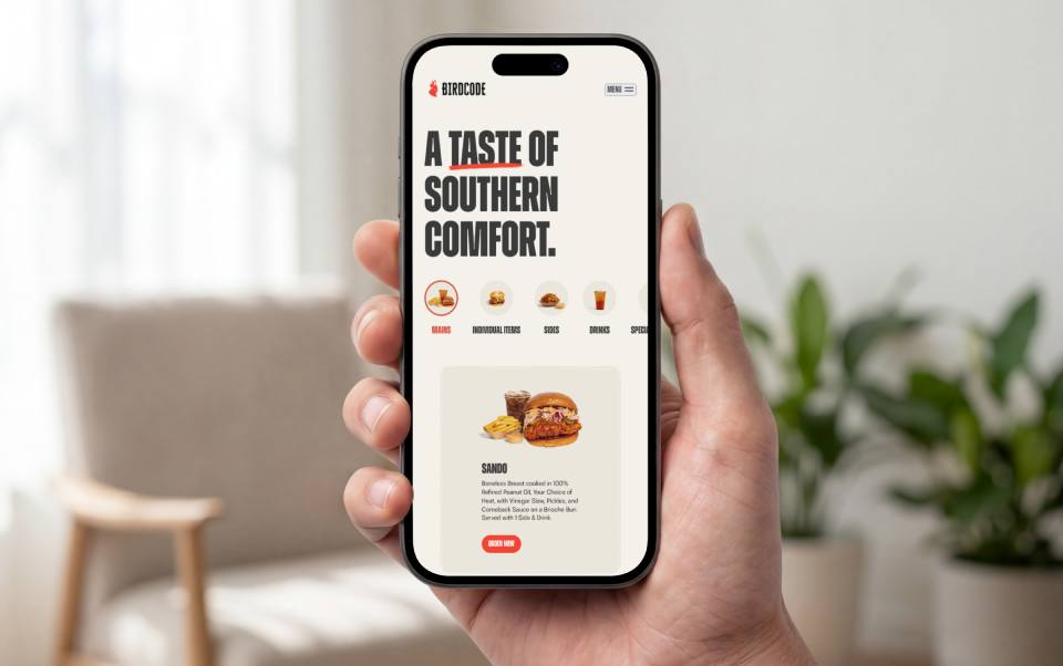
A website can feel trustworthy on a desktop computer and completely fall apart on a phone.
For many small businesses, that’s a serious problem. Potential customers may discover you through a Google search, social media, a referral, or an online directory, and there’s a good chance their first interaction with your website happens on a mobile device.
If the text is difficult to read, buttons are too small to tap, images don’t fit the screen, or visitors have to pinch and zoom to find information, the experience immediately feels less professional.
A mobile-friendly website should make the important information just as easy to access on a smaller screen as it is on a desktop.
That includes things like:
- Readable text without requiring visitors to zoom
- Buttons and links that are easy to tap
- Simple navigation that works well on smaller screens
- Forms that are easy to complete
- Images and layouts that adapt to different screen sizes
- Important contact information that’s easy to find
It’s also important to think about how people actually use your website on their phones. Someone looking for an emergency plumber, for example, may primarily want to know whether you serve their area and how quickly they can contact you. Making them navigate through a complicated mobile menu to find a phone number adds unnecessary friction.
Google also uses the mobile version of a site’s content for indexing and ranking through its mobile-first indexing approach, making mobile usability important beyond just the user experience.
But the bigger reason to prioritize mobile design is simple: your customers expect your website to work on the device they’re using.
9. Security and Transparency
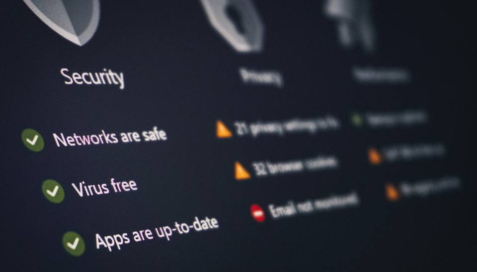
Trust isn’t only about how a website looks. Visitors also want to know that their information is safe and that there’s a real, legitimate business behind the site.
Some of these signals are technical, but they don’t need to be complicated from the visitor’s perspective.
For starters, your website should use HTTPS, so visitors see the secure connection indicator in their browser. This is especially important if your website collects contact information, processes payments, or asks customers to create an account.
Transparency matters just as much.
Visitors should be able to find basic information about your business without having to dig for it. Depending on the type of business you operate, that could include:
- Your business name and location
- Phone number and email address
- Business hours
- Privacy policy
- Terms or other relevant legal policies
- Information about how you handle submitted information
These details can help answer a question that visitors may not consciously be asking: “Who am I actually dealing with?”
Your privacy and legal information doesn’t need to dominate the website, either. It simply needs to be accessible and written clearly enough that visitors can understand what they’re agreeing to. If you’re unsure what policies your business website may need, our practical guide to website legal policies covers the basics in plain language.
You should also be careful about the trust signals you choose to display. Security badges, certifications, awards, guarantees, and professional memberships can be helpful when they’re legitimate and relevant. Adding a collection of badges simply because they look reassuring can have the opposite effect if visitors don’t understand what they represent.
Ultimately, transparency comes down to giving visitors enough information to make a comfortable decision.
A trustworthy website doesn’t try to hide the details that matter. It makes them easy to find.
10. A Clear Path to the Next Step
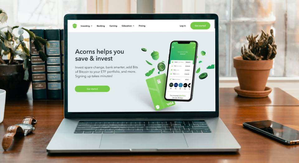
Once someone has found the information they’re looking for and decided that your business might be a good fit, the next step should be obvious. That might mean requesting a quote, booking a consultation, calling your business, scheduling an appointment, or simply learning more about a particular service.
This is where a clear call to action can make a big difference.
A good CTA tells visitors what they can expect when they click. “Request a Free Quote” is more informative than “Submit,” while “Book a Consultation” gives someone a much clearer idea of what will happen next than “Click Here.”
The CTA should also match where the visitor is in their decision-making process.
Someone reading your About page may not be ready to request a quote yet. A prompt to learn more about your services or meet the team may make more sense. Someone who has just finished reading a detailed service page, however, may be ready to take the next step.
Don’t Make Every CTA a Sales Pitch
One of the easiest ways to make a website feel less trustworthy is to constantly push visitors toward a purchase or inquiry.
Every page doesn’t need a giant “Contact Us Now” button competing for attention.
Instead, think about what would be most useful to the visitor at that particular point in their journey. Sometimes the right next step is contacting you. Other times, it’s reading another helpful resource, viewing examples of your work, or learning more about a specific service.
This creates a more natural experience because you’re helping visitors make a decision rather than trying to force one.
Your calls to action should also be visually easy to identify. Visitors shouldn’t have to search through a page to figure out which button or link is important.
The best websites create a sense of direction without making visitors feel pressured.
When people know where they are, what they’ve learned, and what they can do next, they’re more likely to feel confident moving forward.
What Makes a Website Feel Untrustworthy?

We’ve looked at the elements that can make a website feel credible. But it’s just as useful to look at the other side of the equation.
Sometimes, a website doesn’t need a major problem to create doubt. A collection of small issues can be enough to make a visitor hesitate.
Common trust-breaking red flags include:
- An outdated design that makes the business appear neglected
- Broken links or missing pages that suggest the website isn’t being maintained
- Poor grammar or spelling mistakes that undermine professionalism
- Confusing navigation that makes basic information difficult to find
- Aggressive pop-ups that interrupt visitors before they’ve had a chance to explore
- Generic or excessive stock photography that makes the business feel impersonal
- Missing or difficult-to-find contact information that leaves visitors questioning whether the business is legitimate
- Inconsistent branding across different pages
- Slow-loading or unreliable pages that create frustration
- Overly exaggerated claims that sound more like marketing hype than something a visitor can believe
None of these automatically means a business is untrustworthy. A small spelling mistake doesn’t suddenly make a company dishonest, for example.
The problem is what happens when several of these signals appear together.
A visitor may not consciously identify each issue, but they can still come away with the feeling that something isn’t quite right. And when someone is deciding whether to spend their money or trust you with an important service, uncertainty can be enough to send them elsewhere.
The good news is that many of these problems are relatively easy to fix.
You don’t necessarily need a completely new website. Sometimes improving a handful of high-impact details can make the existing experience feel significantly more professional, credible, and easier to use.
How to Improve Website Trust Without Starting Over
Start by fixing the things visitors are most likely to notice. Update outdated photos and information, make your contact details easy to find, replace vague messaging with something more specific, and make sure your site works smoothly on mobile.
Then look at your website from a new visitor’s perspective. Can they quickly understand what you do? Can they find the information they need? Is there clear evidence that other customers trust your business? And is it obvious what they should do next?
Often, improving these fundamentals can make a bigger difference than adding another feature or redesigning your website simply for the sake of a new look.
Conclusion: A Trustworthy Website Makes It Easier to Say Yes
A trustworthy website isn’t about having the newest design or adding every possible trust signal.
It’s about creating an experience that feels professional, clear, reliable, and genuine from the moment someone arrives. Visitors should be able to understand your business, find what they need, see evidence that you can deliver, and take the next step without unnecessary friction.
For small businesses, these details can have a meaningful impact. Your website often has to build confidence before you ever get the opportunity to speak with a potential customer.
If your website isn’t creating the impression you want, start with the fundamentals. Improve the areas that create the most uncertainty, remove unnecessary friction, and make sure the experience reflects the quality of the business behind it.
At Alliance Web Design, we help small businesses create websites that aren’t just professional-looking, but clear, useful, and designed around the people they’re trying to reach. If you’re wondering whether your current website is helping or hurting your credibility, we’d be happy to take a look and help you identify where there’s room for improvement.